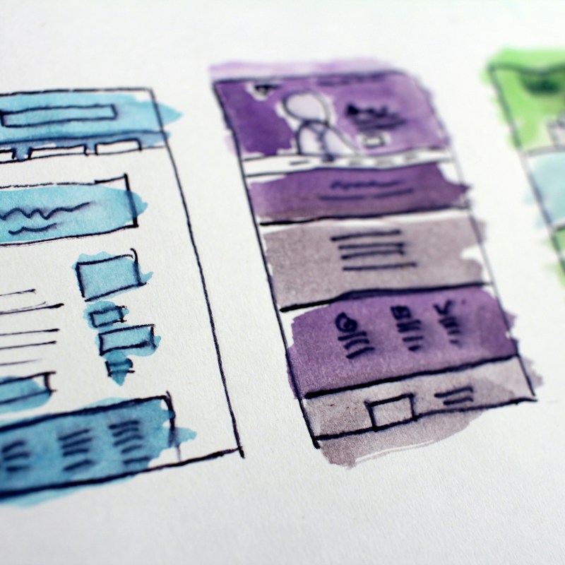

Visual hierarchy in web design is what separates a site that converts from one that just exists. Every visitor who lands on your page makes a decision in under 50 milliseconds about whether to stay or leave. That decision is driven almost entirely by how your design elements are arranged and prioritised. When visual hierarchy in web design is done right, visitors instinctively know where to look, what to read, and which action to take next. When it is done wrong, they bounce.
Research shows that 94% of first impressions are design related, and users form opinions about your website within just 50 milliseconds. In that fraction of a second, visual hierarchy is doing all the heavy lifting. It tells the eye where to go first, second, and third. It guides attention toward your headline, your value proposition, and your call to action without the visitor ever consciously thinking about it.
What Visual Hierarchy in Web Design Actually Means
Visual hierarchy is the arrangement of design elements in order of importance. It uses contrast, scale, colour, spacing, and typography to signal which elements matter most. The human eye does not read a web page evenly. It scans. It jumps. It gravitates toward things that stand out. A well designed page uses that natural scanning behaviour to lead the visitor through a deliberate path, from the most important information down to the action you want them to take.
Think of visual hierarchy as a priority system. Your headline comes first. Your subheadline comes second. Your supporting content comes third. Your call to action sits exactly where the eye lands after absorbing the value proposition. Every element has a rank, and good design makes that rank visible without the visitor ever noticing the system behind it.
The F Shaped Reading Pattern and Why It Matters
Eye tracking research from the Nielsen Norman Group found that users consistently read web content in an F shaped pattern. They start at the top left, scan horizontally across the upper portion of the page, move down slightly, scan across again in a shorter movement, and then track vertically down the left side. This means the left side of your page gets more attention than the right, and the top gets more than the bottom.
If your most important content is buried in the bottom right corner, most visitors will never see it. Visual hierarchy in web design works with this scanning pattern, not against it. Place your headline and primary call to action where the eye naturally lands. Use the left column for your strongest messaging.
Scale and Contrast: The Two Levers That Control Attention
Size is the most obvious tool in visual hierarchy. Larger elements draw the eye first. A headline at 48 pixels commands more attention than body text at 16 pixels. A call to action button that fills 300 pixels of width will always outperform a small text link buried in a paragraph.
Contrast works the same way. A bold orange button on a white background is impossible to miss. A grey button on a slightly lighter grey background is invisible. According to web design statistics, visual hierarchy done right can guide users to calls to action and boost conversions by up to 30%. Sites with cluttered designs see bounce rates 50% higher than clean, well structured alternatives.
If you want someone to notice something, make it bigger and make it stand out from its surroundings. If you want something to recede, make it smaller and reduce contrast. Every element on your page should be deliberately sized and coloured based on how much attention it deserves.
White Space: The Most Underrated Design Tool
White space is the empty area between design elements. Most businesses treat it as wasted space. They cram more content, more buttons, more images into every pixel, assuming that more information means more persuasion. The opposite is true.
White space creates breathing room. It gives the eye a place to rest between elements. It separates sections so the brain can process each one individually. A page with generous spacing around its headline, value proposition, and call to action feels clear and confident. A page packed edge to edge feels chaotic and cheap.
We worked with a Cape Town property developer whose website was dense with information. Every section had paragraphs of text, multiple images, and competing buttons. We rebuilt the page with deliberate white space, a single dominant headline, one supporting paragraph, and one primary call to action per section. Enquiries went up. Bounce rate dropped by a third. Nothing changed about the content. Only the visual hierarchy changed. You can see more of this kind of work on our portfolio page.
Typography Hierarchy: How Font Choices Guide the Reader
Typography is where most visual hierarchy breaks down. Businesses use too many fonts, too many sizes, and too little consistency. The result is a page where nothing stands out because everything is competing for attention.
A strong typographic hierarchy uses no more than three font sizes across a page. One size for headlines. One for subheadings. One for body text. The size differences should be dramatic enough that the eye can instantly distinguish between them. Font weight matters too. Bold headlines pull attention. Regular weight body text recedes. The key is consistency.
Colour and Directional Cues in Visual Hierarchy
Colour is one of the fastest ways to establish hierarchy. A single accent colour used for buttons and links creates an instant visual trail. The eye follows that colour across the page, jumping from one action point to the next. When every element is a different colour, the eye has no trail to follow and the hierarchy disappears.
Directional cues work alongside colour. Arrows pointing toward a call to action. An image of a person looking toward the button you want clicked. These cues are subtle but powerful. The research on visual hierarchy and UX shows that users form design opinions in 50 milliseconds, and those opinions are heavily influenced by colour and spatial arrangement.
Common Visual Hierarchy Mistakes That Kill Conversions
The most common mistake is treating every element as equally important. When everything is bold, nothing is bold. When every section has a button, no single action stands out. When the page has five different fonts and eight different colours, the hierarchy collapses and the visitor leaves.
Another mistake is placing the primary call to action below the fold with no visual cue to scroll. If the visitor does not see the action you want them to take within the first three seconds, they are gone. The web design data from Figma shows that better checkout design alone can increase conversion rates by over 35%.
How to Audit Your Own Visual Hierarchy
You do not need expensive tools to check your visual hierarchy. Open your website on a desktop and on a mobile phone. Squint at the page. What stands out first? If the answer is your call to action, your hierarchy is working. If the answer is your logo, a stock photo, or a block of text, you have a problem.
Try the five second test. Show your page to someone for five seconds, then close it and ask them what they remember. If they recall your headline and your offer, the hierarchy is clear. If they recall nothing, the hierarchy needs work.
Building Visual Hierarchy Into Your Marketing System
Visual hierarchy in web design is not a one time task. It is a system that should be applied consistently across every page, every landing page, and every campaign. When your hierarchy is consistent, visitors learn how to navigate your site quickly, they find what they need faster, and they convert at higher rates.
We have seen this play out across multiple client projects. A retail brand we work with had a homepage that tried to serve every audience at once. We restructured it with a clear visual hierarchy that led visitors to the primary action first. The result was a measurable lift in engagement and enquiry rates. The content did not change. The hierarchy did. That is the difference between design that looks good and design that works.
If you want to build a website where visual hierarchy drives more conversions for your business, the Solution Labs team can help you put the right system in place.